Using data sourced from earlier stages, including user surveys and interviews, task analysis, and personas, the next stage undertaken was wireframing of design concepts. This included ideation of designs, and creation of low-fidelity wireframes to be used for an early-stage interactive prototype, for user testing.
5.1 Design Ideation
Both team members, again working in parallel, agreed to produce separate designs.
The design concept by the author was based on word clouds, as popularised by blogging software, WordPress. A word cloud is “an image composed of words used in a particular text or subject, in which the size of each word indicates its frequency or importance.” (Oxforddictionaries.com 2017)
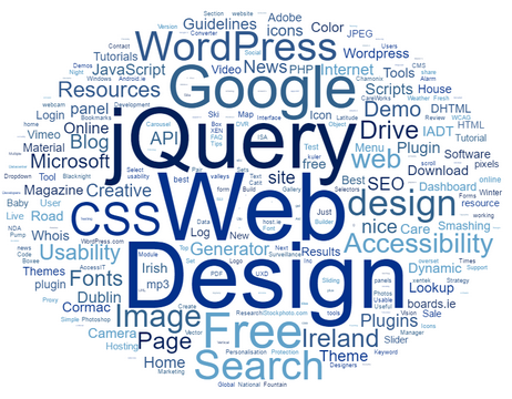
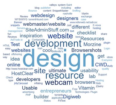
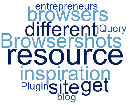
The words used to create the tag cloud, in this first design, would be taken from the page meta title. Each word in the title (minus stop words, such as “the”, “if” etc.) would be treated as an individual tag, and the more frequently a word appeared across various bookmarks, the larger it would appear in the tag cloud. Clicking a tag would take the user through to a second-level cloud composed of tags that that had appeared in pages titles with the tag from the first level cloud, and this would be repeated as the user drilled further down.
In the example below (Figure 18), the author goes from a top-level tag cloud generated by 1050 bookmarks, to a third-level tag cloud of 11 bookmarks (Figure 20) by clicking “web” in the top level cloud, followed by “design” in the second level cloud (Figure 19).
5.2 Tag Cloud-type design
5.2.1 Version 1 – Tag Cloud-type design
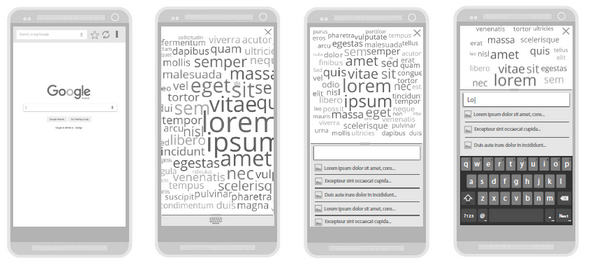
In this version the tag cloud takes up the full screen. An expandable / collapsible panel also allows the user to perform a manual search for bookmarks. Autocomplete functionality lists results by page title, below the textbox, and in cloud form above.
5.2.2 Version 2 – Tag Cloud-type design
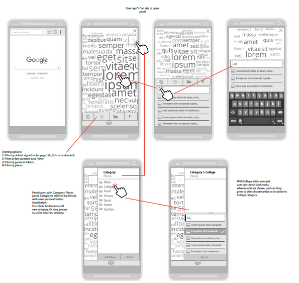
In the first iteration an attempt is made to merge the design with the listview-type design, shown below (Figure 26). Also, filtering options have been added, to allow the user view clouds weighed by other factors, such as last-accessed date and location.
5.2.3 Version 4 – Tag Cloud-type design
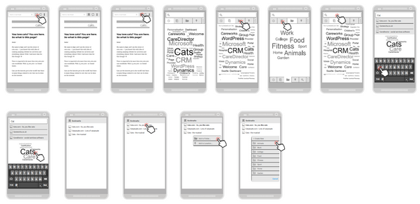
This version further explores the possibility of merging both design concepts. A tabbed panel has also been added to allow filtering based on different tag-weighing options.
5.2.4 Version 5 – Tag Cloud-type design

In the fourth iteration the tag cloud-type design is merged with the listview-type design by giving the user the option of a view of each via a tabbed panel.
5.2.5 Version 6 – Tag Cloud-type design
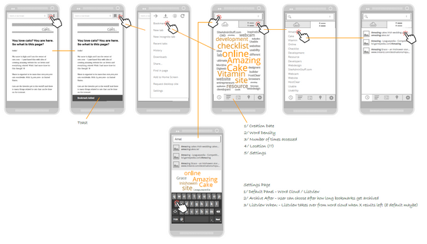
In this iteration the filtering options are moved to the bottom of the screen in keeping with Google’s Material Design guidelines. Also weighing by tag colour is included as a signifier to users. This version was used to create the first prototype.
5.3 Listview-type design
This listview-type design concept was a separate design, created by Andrew Cassidy, in parallel to the author’s tag cloud-type design.
5.3.1 Version 1 – Listview-type design
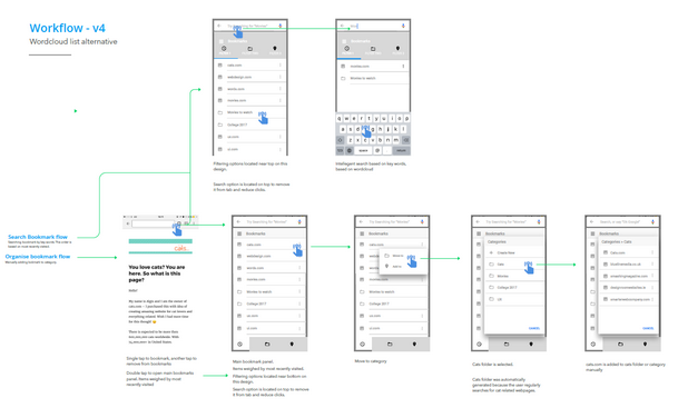
In this design bookmarks are listed by a more traditional list view, a tabbed panel allow the user filter results. Also, folders and page titles are used, as opposed to tags.
5.3.2 Version 2 – Listview-type design
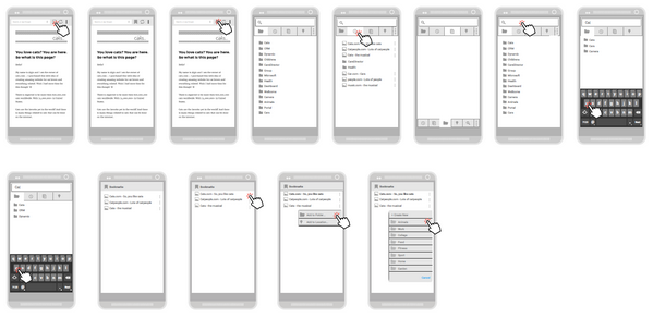
In this first iteration of the listview-type design, tags replace page titles, and folders have been removed. The functionality is almost the same as the tag cloud version, the only major difference is how the tags are visualised. After this iteration both designs were merged (see section 5.2.4, above).
