This content is password protected. You will find the password on my CV, or please contact me for access.
Author: Cormac Maher
CareDirector v6 UI / UX Design
Background
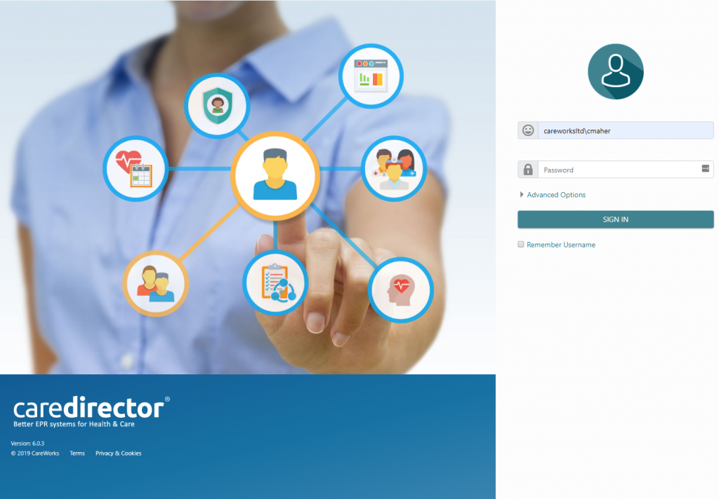
v6 is the latest version of CareWorks’ core product, CareDirector. CareDirector is a system for Community Health, Mental Health and Social Services. It enables clinicians and social workers to record details, processes and outcomes, of the care they provide.
Originally built on Microsoft Dynamics CRM 4.0 in 2008, running only on Microsoft Internet Explorer, for v6 it was decided to completely rebuild CareDirector as a standalone, browser-independent product.
Work began in early 2018 and the first release of CareDirector v6 was in April 2019.
As the UX designer I was responsible for all UI artwork and design, user experience design, accessibility, responsive design, front-end, and CSS.
Below are various screens from CareDirector v6.
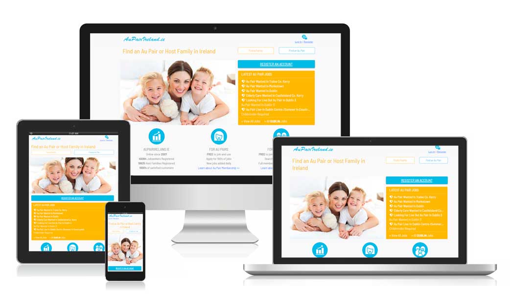
AuPairIreland.ie
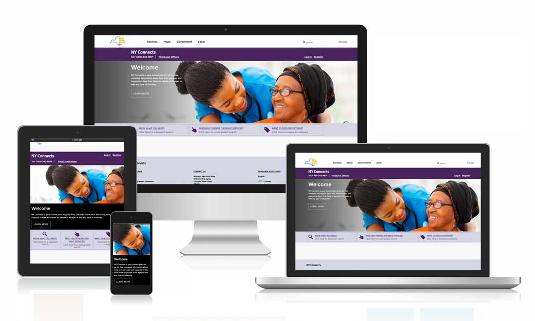
AuPairIreland.ie is a responsive, HTML5, CSS-based website.
Primary users were female, aged between 18-43 and the majority of visitors accessed the site using mobile devices. With this in mind, it was designed using a mobile-first approach. The existing PHP powered site was deconstructed, old HTML markup and CSS removed, and it was rebuilt using the Bootstrap framework to manage the layout, components and utilities.
I was responsible for all aspects of the rebuild, including design, accessibility design, responsive design and front-end (HTML and custom CSS).
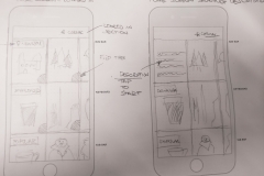
Wireframes – Page 3
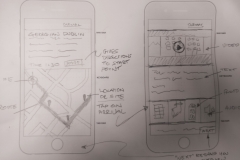
Wireframes – Page 2
Wireframes, taken from a bookmark redesign project, show eight stages of an iterative design process, from initial concept to finished high-fidelity, interactive prototype.
The wireframes were created using Adobe Illustrator, and the interactive prototype was created using Marvel App.
Add the Day – countdown app and widget for Android
Add the Day is an app I designed for Android. It is designed to count down to any event the user chooses, and allows the user to add a location for that event, the weather in that location, and background images.
I produced all wireframes and visual assets, and the Android XML layouts.
With Add the Day, the background image can either be a single image taken from the users’ gallery, a slideshow of images taken from their gallery, or a webcam image from the event location. The background slideshow, and the refresh rate of the webcam are both user-configurable, and the background is animated using a Ken Burns effect (a type of panning and zooming effect used on still images), to give it a live feel.
Events can be viewed in full-screen, in an app view, or as home screen widgets – the choice of widgets include:
- 4×3 list view widget
- 3×3 event widget
- 3×3 stack event widget
- 2×2 stack event widget
You can customise your event view to suit the event type. Local weather for sports events and holidays, and you can add local webcams as event backgrounds for a live view.
You can see the current weather conditions, and a five day forecast, in the event location on your app view, and on your event widgets.
Add the Day Screen Shots
10 – Bibliography
Section 1
Jonson, B (2005). Design Ideation: the conceptual sketch in the digital age, Retrieved 18 April 2017, from http://www.sciencedirect.com/science/article/pii/S0142694X05000189
What is…Ideation? Retrieved November 5, 2016 from https://www.interaction-design.org/literature/article/what-is-ideation Read On >>10 – Bibliography
9 – References
Section 1
Ideation (creative process). (2017). En.wikipedia.org. Retrieved 18 April 2017, from https://en.wikipedia.org/wiki/Ideation_(creative_process)
Benjamin, A Design: How to define the problem. – Prototyping: From UX to Front End. (2017). Prototyping: From UX to Front End. Retrieved 18 April 2017, from https://blog.prototypr.io/design-how-to-define-the-problem-5361cccb2fcb#.vzy05lkr7 Read On >>9 – References
8 – Final Interactive Prototype
The final interactive prototype , see below, was created using Marvel App, available at http://www.marvelapp.com. Marvel App was chosen as it was felt the InVision’s image compression detracted from the user experience and visual quality of the app.
Figure 32 – High-Fidelity interactive prototype of a redesigned bookmarking system. Read On >>8 – Final Interactive Prototype
7 – Post-User Test Design Iteration
7.1 Version 1
Based on feedback from user testing, functionality is added to allow users manually add tags, via a toast notification. Read On >>7 – Post-User Test Design Iteration
6 – First Interactive Prototype and User Testing
The first interactive prototype was built using online prototyping tool, InVision, available at http://www.invisionapp.com.
Four user test participants were chosen for user testing, they were users of both iOS and Android mobile devices. Consent to record was given by each participant at the beginning of the interview. Read On >>6 – First Interactive Prototype and User Testing
5 – Wireframes
Using data sourced from earlier stages, including user surveys and interviews, task analysis, and personas, the next stage undertaken was wireframing of design concepts. This included ideation of designs, and creation of low-fidelity wireframes to be used for an early-stage interactive prototype, for user testing.
5.1 Design Ideation
Both team members, again working in parallel, agreed to produce separate designs.
The design concept by the author was based on word clouds, as popularised by blogging software, WordPress. A word cloud is “an image composed of words used in a particular text or subject, in which the size of each word indicates its frequency or importance.” (Oxforddictionaries.com 2017) Read On >>5 – Wireframes