Using CSS to detect no search results, and display a placeholder

I was having an issue displaying a No Results placeholder – the code-behind was PHP, and it was using a while statement to display the results, when there were no results the code was adding whitespace so showing a placeholder using :empty was not an option. The obvious thing to do was to change the while to an if/else but I have no real understanding of PHP so that was not really an option.

After a lot of searching for solutions, including PHP, JavaScript and removing unnecessary whitespace in the PHP I ended up going back to basics and using adjacent sibling selectors – which turned out to be a very simple solution. It’s probably not ideal but it worked perfectly for me, and it could do for you as well.

You simply add your No Result placeholder as the last element in the results array and you add a rule to to hide it when your CSS rule matches the . So,

<ul>
<li>value</li>
<li class="noval"><span class="sr-only">No Results Found</li>
</ul>

will trigger hiding the placeholder, but

<ul>
<li class="noval"><span class="sr-only">No Results Found</li>
</ul>

will display it.

The CSS is very simple:

li.noval {
list-style-type:none;
margin-left: -40px;
background-image: url(//aupairireland.ie/svg/bg-norecords.svg);
background-size: 150px;
background-position:left center;
background-repeat: no-repeat;
min-height: 110px;
}
li + li.noval {
display: none;
}

And that’s it. 

I added the .sr-only text for accessibility reasons, because I am using an image for the placeholder, so you can ignore it if you are displaying a text message. The CSS for .sr-only is:

.sr-only {
position: absolute;
width: 1px;
height: 1px;
padding: 0;
margin: -1px;
overflow: hidden;
clip: rect(0, 0, 0, 0);
border: 0;
}

The results are below:


The only drawback I can think of, in terms of usability and accessibility is that some screen readers may pick up the .noval content if it’s visually hidden – if that’s a major concern it should be a fairly simple matter to hide or display that using JavaScript to add the HTML5 attribute hidden or the Aria attribute aria-hidden="true" to the <li class="noval">

Here’s the Codepen for it 

See the Pen Using CSS to detect no search results, and display a placeholder by Cormac Maher (@Cormac-Maher) on CodePen.light

Pure CSS responsive menu, vertical to hamburger

I’ve been looking for, and unable to find, a menu that goes from a vertical menu to hamburger menu.

So this is my attempt at making one. As an added bonus it’s pure CSS, and requires no JS.

I’m not going to explain how it works in detail, but basically the functionality is triggered by changing the state of the (hidden) checkbox, by clicking the label (which is styled as the hamburger), this allows me to use the adjacent sibling combinator Read On >>Pure CSS responsive menu, vertical to hamburger

Viewing your hidden password

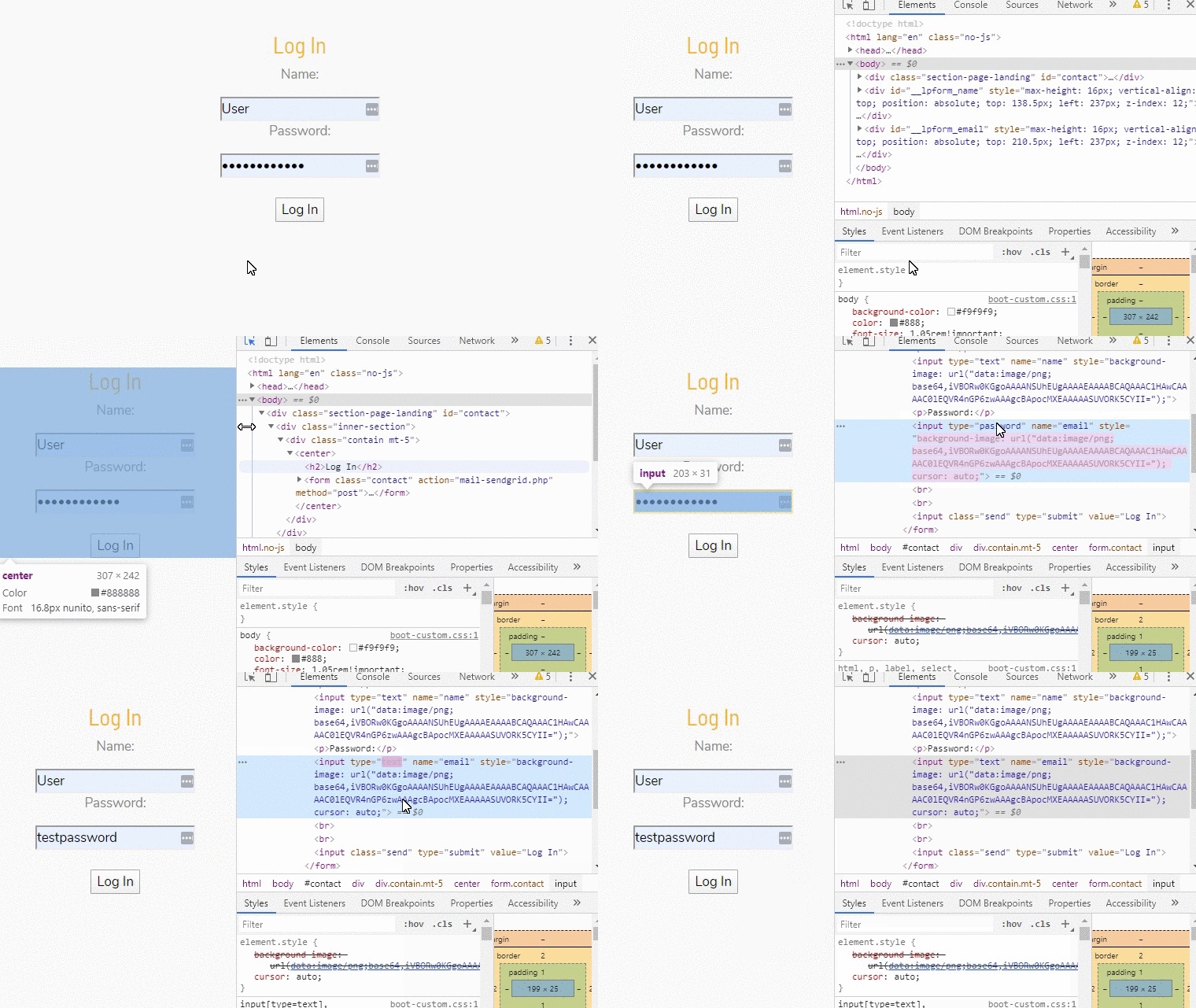
This is a quickie, and not really related to UX. But if you ever find yourself wondering what that auto-filled password you saved a few years ago is, do the following.

  • Press f-12 on the browser you’re using. This will open the developer tools panel on most browsers. If your chosen browser doesn’t have developer tools installed you can probably download them from the browser’s add-on/plugin/etc. store.
  •  On the login form, select the password field (element), which has the masked password.
  • In the developer tools panel you will see the HTML code for that element highlighted.
  • Double-click where it says “password” and change it to “text”
  • Yay!


Automatically add an asterisk to a required field

Very quick one this.

Add the class ‘required’ to your label

<label for="epass" class="required">Password</label>
<input type="password" required="required" id="epass" name="epass" class="form-control">

and define the class in your stylesheet

label.required::after {
content: '*';
margin-left: .4rem;
color: #dc3545;
}

hey presto!

Creating a Likert Scale icon font

I’m in the process of creating a web-based satisfaction survey for the hospitality sector, the survey uses a five-point Likert scale.

I found this neat little jQuery rating widget by Deepak Kamatt, on CodePen, but in its default state the widget uses a FontAwesome star icon for rating, which obviously won’t work for a Likert scale. I searched FontAwesome but couldn’t find five consistently styled/designed smileys/emoticons/emojis that indicate each each level of satisfaction. Read On >>Creating a Likert Scale icon font

Pure CSS, accessible custom checkbox/tickbox and label

I created these for a project, where accessibility was mandatory and the primary user was of an older age profile. When considered in context of the target user, standard HTML checkboxes and labels were not ideally suited, the small target area of the label and the checkbox being the main issue. Read On >>Pure CSS, accessible custom checkbox/tickbox and label