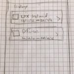
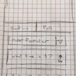
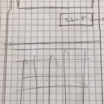
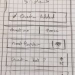
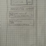
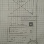
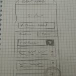
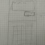
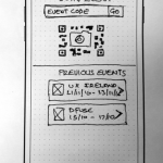
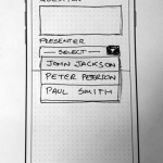
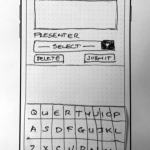
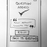
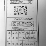
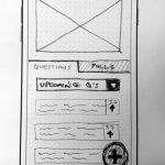
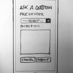
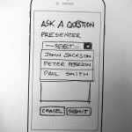
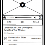
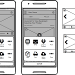
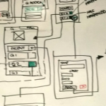
As part of a formal testing process, we undertook testing our paper prototypes, and the goals and the scenarios we had developed.
The tasks we were testing were those identified, during the research stage, as the most popular features of the product. We would test for learnability, efficiency of use, errors and user satisfaction.
Data collection was via video recording and test subjects were to be encouraged to engage in think aloud protocol (TAP).
We were to test two tasks.
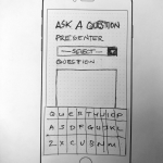
Task #1 – An audience member should be able to ask a question, mid-event, within 3 clicks
Task Scenario
You are attending a Technology in Nutrition conference as a member of the audience. You have pre-loaded the conference’s Audience Engagement app onto your phone.
Task
During the event, while presenter Peter Peterson is speaking you have a question you would like to put to him.
The event access code is displayed on the event stage – you need to post the question using the Audience Engagement app.
Pilot Test
We carried out two pilot tests.
User feedback from the first Pilot test included:
- Do live question need a title?
- What if I want to share questions to members of my team?
- A lot of question around what are polls? should that be it’s own separate tab or should it be more subtle?
A lot of feedback, not particularly pertinent to the app functionality, actually related to the quality of the wireframes themselves. Users were confused by the visual hierarchy of the wireframes. The lack of signifiers and contextual clues on input elements was leading test subjects to misinterpret the function of elements.
Based on this feedback, time was spent adding more detail to the wireframes, before we moved onto the second pilot test.
User feedback from the second Pilot test included:
- Live sharing, link to timestamp in video?
- Where are the questions I’ve just asked?
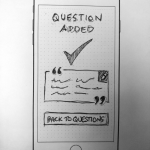
The user we tested on was confused after they had submitted their question – in our wireframe we had used a small alert element on the Questions page to indicate the successful submission. The test participant had missed this alert completely, and was unsure as to whether they had completed the process or not . Based on this feedback we added a confirmation page after question submission.
User Testing
User testing was carried out on three participants, all three represented our target group – they:
- Were proficient users of technology, and owners of mobile devices, people who regularly used the Internet, and they were occasionally members of audiences, either in person or remotely
- Shared the characteristics of our target users
- Were familiar with the same relevant technologies as our target users, and were intermediate to expert users
User feedback from user testing included:
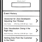
- On Question Listing page Add Question button needs to be more prominent
- Increase white space from under question inputs on Add Question page
- Submit button needs to be larger on Add Question page
Final Prototypes
Task #2 – At the end of the day, an audience member should be able to access downloaded materials within 2 clicks
Task Scenario
Earlier in the day you attended a tech talk called “Javascript for Java Developers: Adjusting Your Mindset”. At the talk, the presenter used an Audience Engagement app that allowed the audience to ask questions, vote in polls, and follow the slides within the app. The talk was also live streamed in the app, for audience members who were unable to join in person.
At the talk, you installed the app on your smartphone, joined the event that the presenter has set up for the talk, and participated in the Q&A.
The next day, you’re in the office and are telling your co-workers about the talk. You decide you want to download the slides from the talk and share them with the rest of the office, via your Dropbox account.
Task
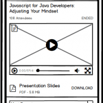
Access the event “Javascript for Java Developers: Adjusting Your Mindset” and download the slides to your Dropbox account.
User Testing
User testing was carried out on three participants. As in the final test for Task #2, all three represented our target group – they:
- Were proficient users of technology, and owners of mobile devices, people who regularly used the Internet, and they were occasionally members of audiences, either in person or remotely
- Shared the characteristics of our target users
- Were familiar with the same relevant technologies as our target users – intermediate to expert users
User feedback included:
- First participant preferred UI A, as B seemed too busy/crowded
- Download button needs an icon
- Second participant preferred UI A , as the layout seemed familiar
- UI B has less information, some details are hidden
- Third participant preferred UI A as they felt it was cleaner and more data was visible
References
Paper Prototyping. Retrieved November 18, 2016 from http://alistapart.com/article/paperprototyping
Paper prototyping: A primer. Retrieved November 18, 2016 from http://interchangeproject.org/2013/11/02/paper-prototyping/
Paper Prototyping As A Usability Testing Technique. Retrieved November 18, 2016 from http://usabilitygeek.com/paper-prototyping-as-a-usability-testing-technique/
Test Paper Prototypes to Save Time and Money: The Mozilla Case Study. Retrieved November 19, 2016 from https://www.nngroup.com/articles/mozilla-paper-prototype/
Paper Prototyping: Getting User Data Before You Code. Retrieved November 19, 2016 fromhttps://www.nngroup.com/articles/paper-prototyping/
Paper prototypes: The fastest way to test your ideas. Retrieved November 18, 2016 from https://www.lynda.com/Interaction-Design-tutorials/Paper-prototypes-fastest-way-test-your-ideas/476937/540520-4.html
Paper prototyping. https://www.lynda.com/Interaction-Design-tutorials/Paper-prototyping/476938/551743-4.html
